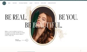
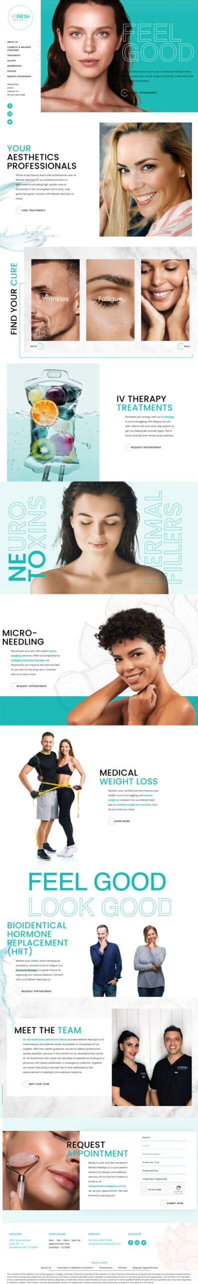
Founded by Kia Rowhanian M.D. and Fatima Rowhanian, Refresh Med Spa LA represents the ideal Los Angeles relaxation, rejuvenation, and wellness experience. Focused and dedicated to delivering the best patient experience in California, this center exemplifies the kind of practices we love working with here at Urge. While coordinating with the client, we quickly understood that Refresh Med Spa LA was not simply a “one-and-done” service provider. Rather, this business is based on complete customer satisfaction and ongoing support, characteristics that our team values greatly.
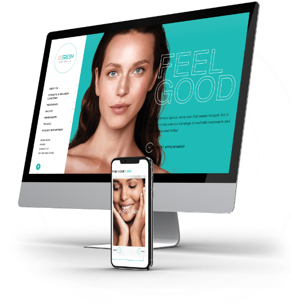
Refresh Med Spa LA
About the Project
Kia and Fatima contacted Urge to establish a web presence in-line with their unique brand vision. At the forefront of their practice is the customer experience. They were looking for a website that highlighted the trendy Los Angeles vibe while also offering the full comforts of home. In order to meet the client’s expectations, our design and content teams had to strike the perfect balance between professionalism and compassion. The Refresh message had to speak to their qualifications without sounding haughty or neglecting their patient-first focus.
Professional Website Design
Whether you need a complete website redesign or are launching something brand new – our expert web designers, developers, SEO content creators and industry experts will deliver you a top-notch site that both converts traffic into leads, and leads into loyal clients.
Don’t settle for anything less than the best website possible!
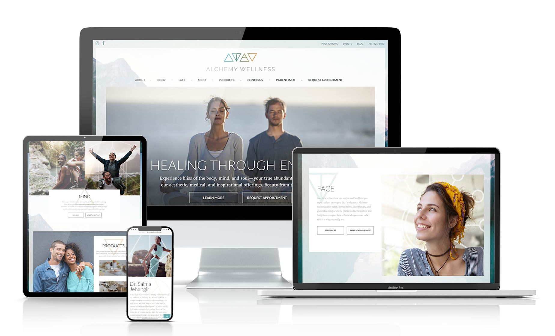
Logo and Branding
Whether you need a complete website redesign or are launching something brand new – our expert web designers, developers, SEO content creators and industry experts will deliver you a top-notch site that both converts traffic into leads, and leads into loyal clients. Don’t settle for anything less than the best website possible!
Let’s Build You a Website That Actually Performs for You
Whether you need a complete website redesign or are launching something brand new – our expert web designers, developers, SEO content creators and industry experts will deliver you a top-notch site that both converts traffic into leads, and leads into loyal clients. Don’t settle for anything less than the best website possible!