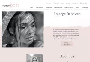
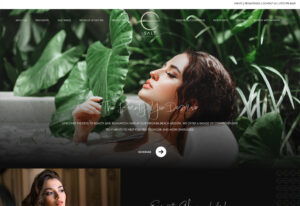
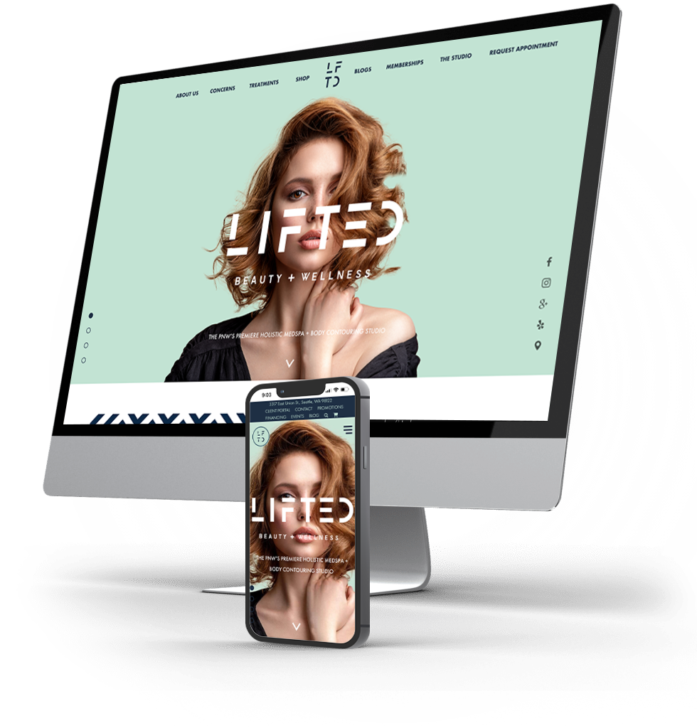
Beth Colombo, owner of Lifted Beauty + Wellness in Seattle, WA, comprehensive overhaul of her website’s design. This endeavor stood out as one of the most ambitious projects ever embraced by our team at Urge, given the client’s precise vision for both the homepage and internal pages. Our mission was to create a website imbued with the essence of an editorial magazine. In terms of structure, Beth’s aspiration was to evoke a sensation more akin to a beauty magazine article rather than slogging through a scholarly essay. With determination, we achieved this goal, yielding remarkable results that resonate with elegance and innovation.
Services Provided
Lifted Beauty + Wellness
About the Project
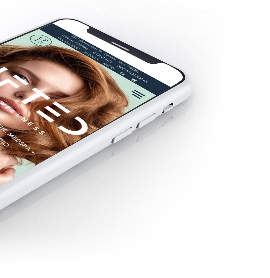
At the beginning of the project, Beth shared example sites with us that gave her the experience that she was opening up a magazine. Our team set out to create clean, crisp layouts that entice the user to keep reading. A concurrent aspiration for this redesign was to incorporate a substantial assortment of personalized visuals depicting the spa and its team. To achieve this, Beth enlisted a photographer’s expertise, enhancing the project with an intimate touch. The imagery seamlessly integrates with the editorial aesthetics, elegantly woven throughout the entire site to foster a sense of unity and coherence. Regarding the new content, Beth’s vision encompassed informative text that imparts guidance in a visually engaging manner, moving beyond conventional text blocks. The tailor-made content places emphasis on the practice’s distinctiveness, illuminating their holistic approach to skincare and body contouring.
Professional Website Design
Whether you need a complete website redesign or are launching something brand new – our expert web designers, developers, SEO content creators and industry experts will deliver you a top-notch site that both converts traffic into leads, and leads into loyal clients.
Don’t settle for anything less than the best website possible!

Let’s Build You a Website That Actually Performs for You
Whether you need a complete website redesign or are launching something brand new – our expert web designers, developers, SEO content creators and industry experts will deliver you a top-notch site that both converts traffic into leads, and leads into loyal clients. Don’t settle for anything less than the best website possible!

