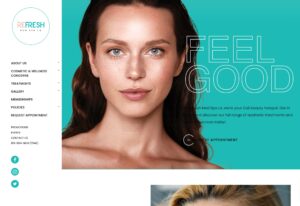
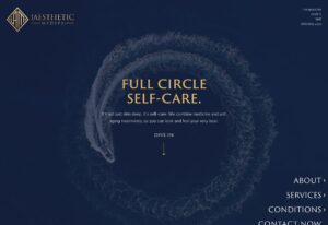
Katonah Eye Care + Aesthetics is an optometry practice located in the hamlet of Katonah, New York. Led by Dr. Steven Gordan, this practice places quality and patient care on top of its priority list. When Dr. Gordan became interested in aesthetics, he turned to Urge to make his vision a reality. The combination of optometry and aesthetics posed a new challenge for the Urge team. A challenge that was met and bested with a cutting-edge design that speaks to the comfort, quality, and reliability of the Katonah Eye Care brand.
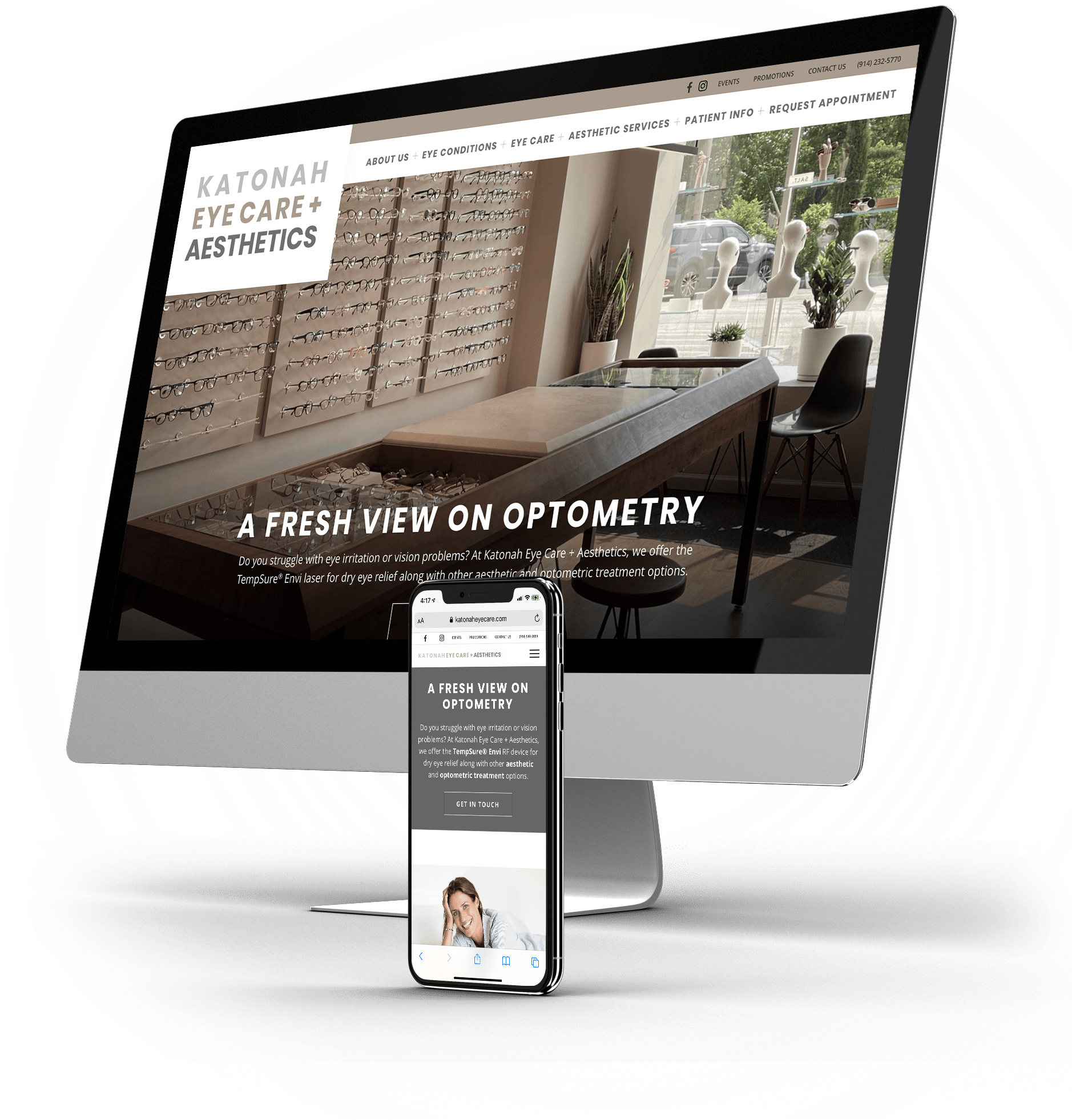
Katonah Eye Care + Aesthetics
About the Project
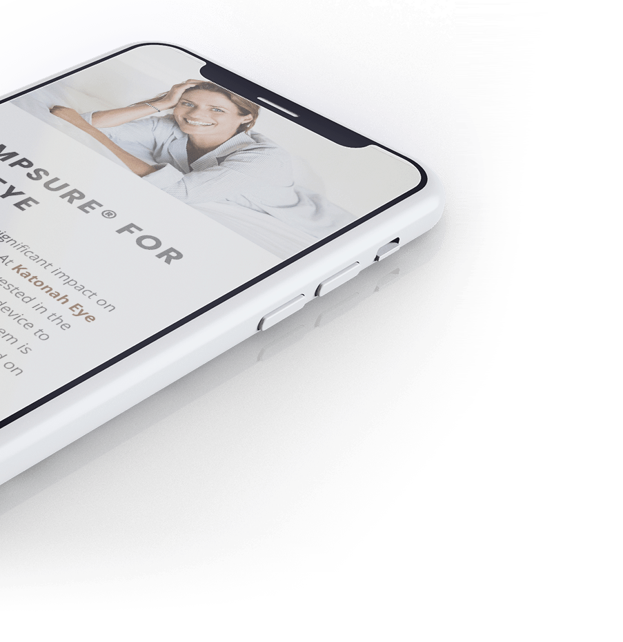
The objective with Katonah Eye Care + Aesthetics was to find a balance between the two different focuses of the office. On the one hand, our team was tasked with promoting Dr. Gordon’s new TempSure® Envi device. On the other, they needed to maintain the high-end boutique that Katonah Eye Care was known for. After careful planning, the perfect balance was found in a neutral color palette and a clear brand identity that spoke for itself.
Professional Website Design
Whether you need a complete website redesign or are launching something brand new – our expert web designers, developers, SEO content creators and industry experts will deliver you a top-notch site that both converts traffic into leads, and leads into loyal clients.
Don’t settle for anything less than the best website possible!

Logo and Branding
Whether you need a complete website redesign or are launching something brand new – our expert web designers, developers, SEO content creators and industry experts will deliver you a top-notch site that both converts traffic into leads, and leads into loyal clients. Don’t settle for anything less than the best website possible!

Let’s Build You a Website That Actually Performs for You
Whether you need a complete website redesign or are launching something brand new – our expert web designers, developers, SEO content creators and industry experts will deliver you a top-notch site that both converts traffic into leads, and leads into loyal clients. Don’t settle for anything less than the best website possible!

