Refresh Med Spa LA
Founded by Kia Rowhanian M.D. and Fatima Rowhanian, Refresh Med Spa LA represents the ideal Los Angeles relaxation, rejuvenation, and wellness experience. Focused and dedicated to delivering the best patient experience in California, this center exemplifies the kind of practices we love working with here at Urge. While coordinating with the client, we quickly understood that Refresh Med Spa LA was not simply a “one-and-done” service provider. Rather, this business is based on complete customer satisfaction and ongoing support, characteristics that our team values greatly.
Service Provided:
About The Project
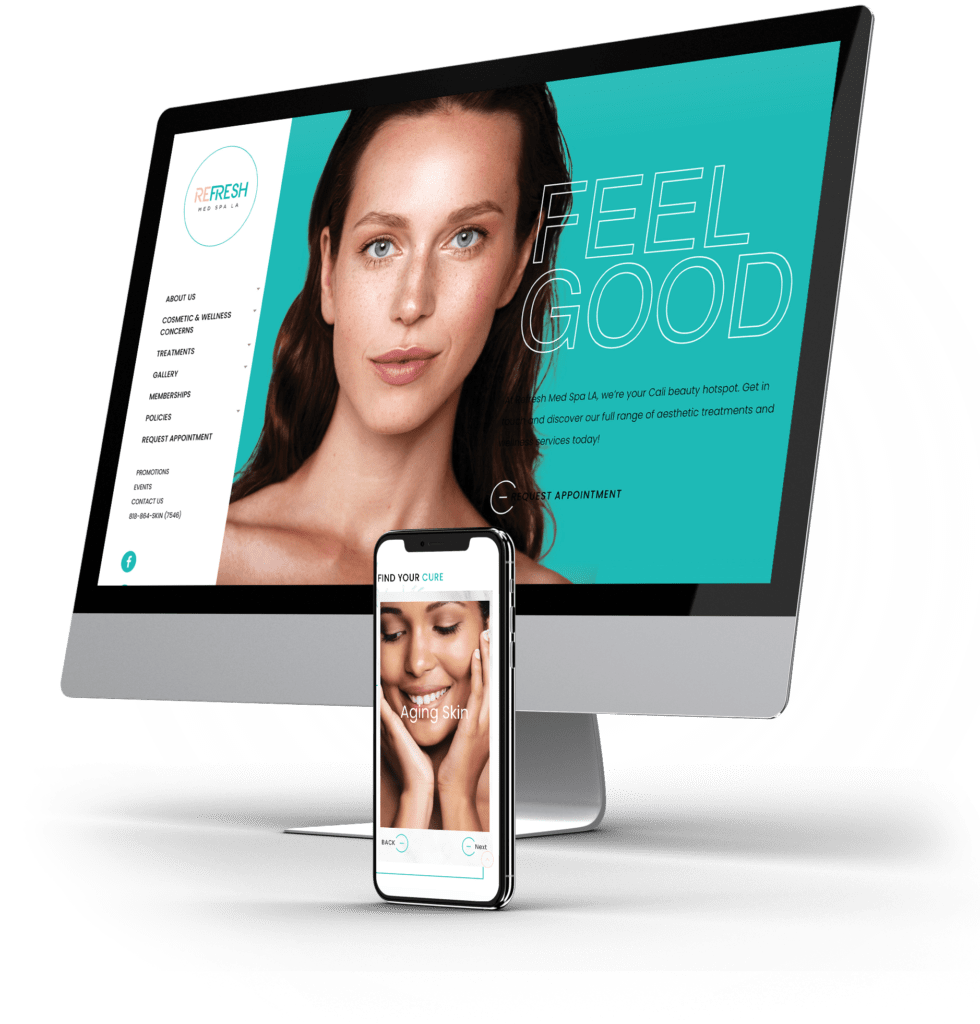
Refresh Med Spa LA: Feel Good | Look Good
Kia and Fatima contacted Urge to establish a web presence in-line with their unique brand vision. At the forefront of their practice is the customer experience. They were looking for a website that highlighted the trendy Los Angeles vibe while also offering the full comforts of home. In order to meet the client’s expectations, our design and content team had to strike the perfect balance between professionalism and compassion. The Refresh message had to speak to their qualifications without sounding haughty or neglecting their patient-first focus.
Results
Since Signing up with Urge, Refresh Med Spa LA Has Seen
1,000+ website sessions
2,200+ website pageviews
64% bounce rate for the entire website
Logo & Branding
For their logo design, the client was interested in pursuing a juxtaposition of vintage and modern aesthetic qualities. The initial mid-century logo design was inspired by a vintage 1920s aesthetic but needed a modern boost. Our design team chose to maintain the refreshing lime and soft pink color scheme while enhancing the lightness of the design. The clear center type and subtext utilize a contemporary font while the circle that envelops the lettering adds tightness to the design without being overbearing. These elements are in keeping with the Refresh Med Spa LA brand, emphasizing freshness, calm, and professional service.


