RKM Aesthetics & Wellness
RKM Aesthetics & Wellness is a Ventura, California practice focused on delivering personalized care. Guided by owner and family medicine physician, Robert K. Moffatt, MD, RKM offers a combination of both aesthetics procedures and wellness support services such as cholesterol screening and diabetes management. What sets this practice apart is its individualized patient approach and comprehensive treatment options. When working on the RKM website, our main focus was to communicate the essence of the practice through a uniquely Californian lens.
Service Provided:
About The Project
RKM Aesthetics & Wellness: Wellness Made Personal
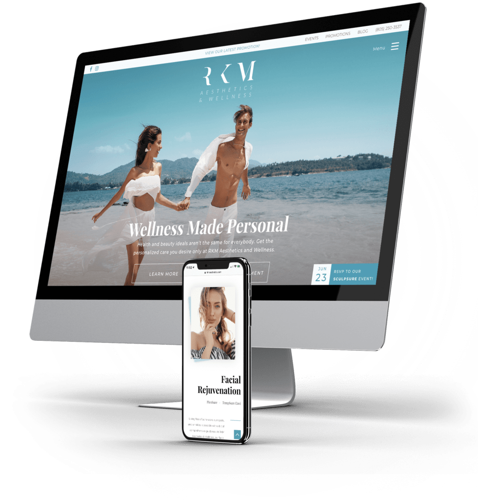
When Dr. Moffatt and his staff contacted our team, their main concern was the lack of “pop” on their website. They wanted to take the practice into a new design direction, placing greater emphasis on oceanography and the beauty of Ventura. Crafting a new color palette and branding style became our immediate goal. Our designers worked rigorously to create a visual character that reflected a calming beach-vibe that simultaneously spoke of the reliability one can expect from RKM. The result was a website refreshing website experience that is both visually soothing and compelling.
Results
Since Signing up with Urge, RKM Aesthetics & Wellness Has Seen
2,900+ new site users
8,000+ website pageviews
58% bounce rate across the entire site
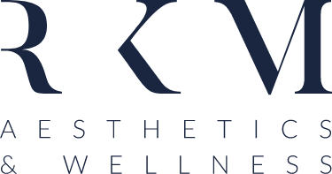
Logo & Branding
Utilizing a classic serif and modern sans serif balance, the new RKM logo speaks of dependability and modern grace. The Hidden left verticals on the lettering add an almost airy quality that is echoed throughout the website design. The simplicity of the logo implies both a lightness and a solid foundation through the almost column-like lettering. Upon the first introduction to the brand, the viewer is made to feel calm, relaxed, and reassured.


